

Ontario Public Service
Designing a new training coordination tool
for the Ministry of Transportation
I served as the lead UX designer for my ministry’s training team, facilitating discovery, design, and user research, and eventually handing off a well-defined and validated product vision to the implementation team that would affect 2700+ employees.
UX research
UI design
TIMELINE:
9 months, 2023-2024
TEAM:
1 PxM 2 product owners
1 lead coordinator 2 coordinators
ROLE:
Lead UX designer
TOOLS:
Miro Ontario Design System
Figma Ontario UXR Guide
Project background
The team had 50+ Excel spreadsheets
— something had to be done
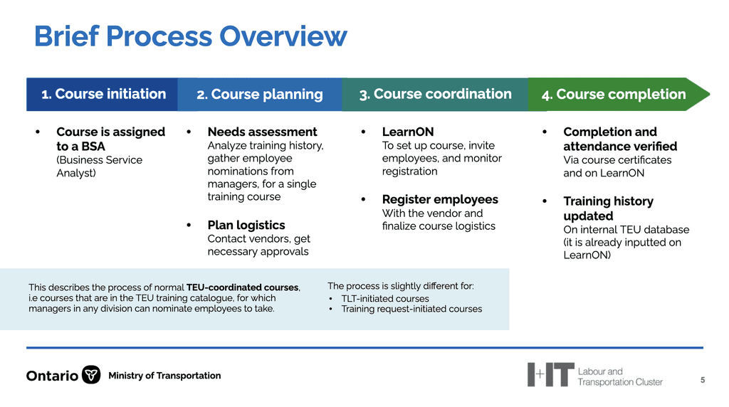
Due to policy changes, the Training & Education Unit within the Ministry of Transportation had been experiencing a x5 increase in employee demand for training.
At its simplest, the training coordinators were being overwhelmed by the amount of manual work needed for basic data entry, collection, and validation tasks throughout their many workflows.
Core problem statement
HMW help training coordinators by reducing the time-consuming, complex, and manual nature of their current workflows?
Designs submitted to implementation team
3 final prototypes


Skip to prototype animation
Discovery phase
Staff were inundated with tedious work,
without any automation support
In our Discovery phase, I held a 10-week sprint as UX lead.
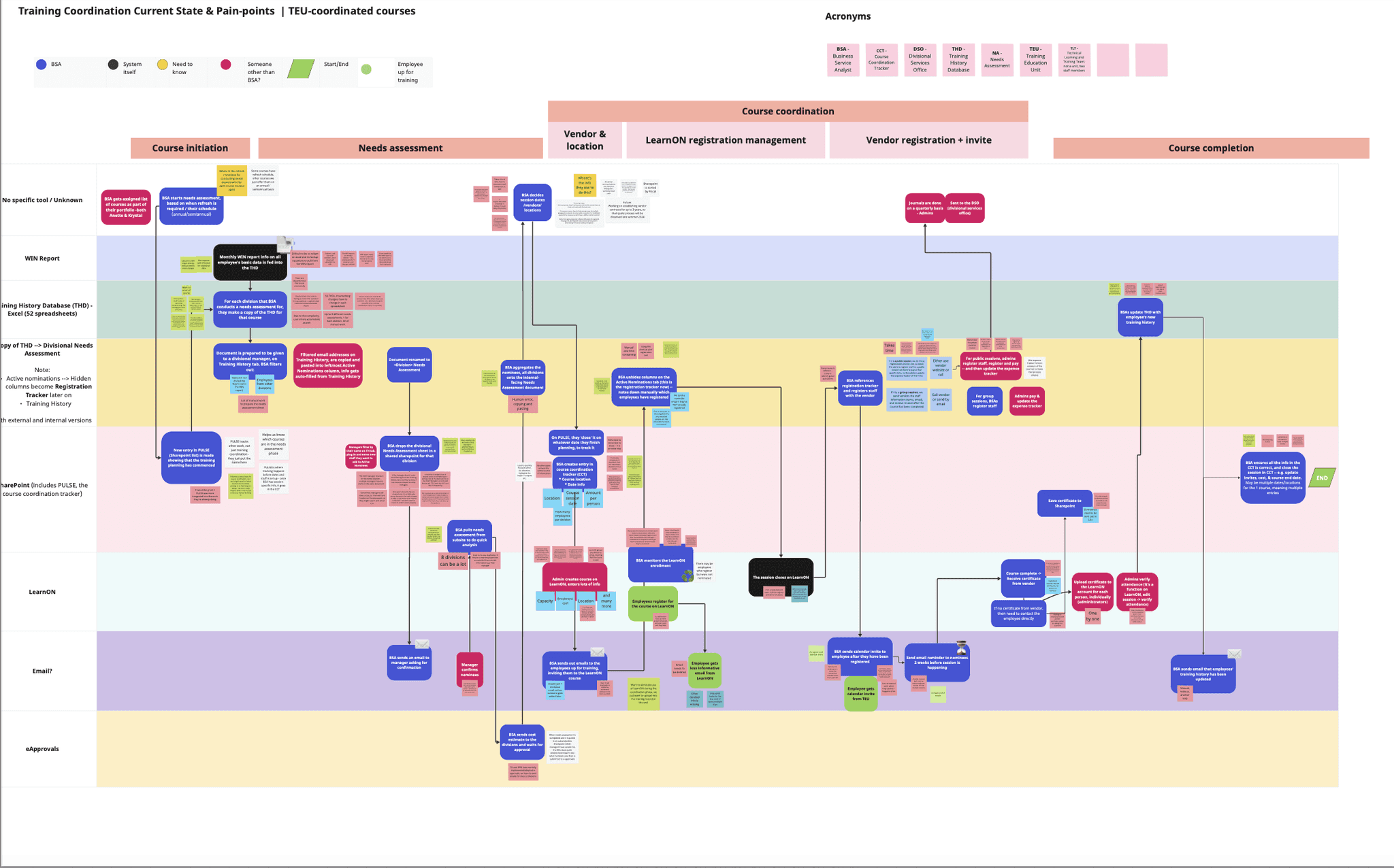
The team’s core work happened in 56 Excel spreadsheets, used in complex, manual ways to manage core aspects of training coordination.
We took the time to understand our partner team's goals, current challenges, and key user groups, totalling 15+ staff & stakeholder interviews.
Core insight #1
6+ tools are used, breaking often, and missing capabilities. A unifying 'single place to work' is desired.
Core insight #2
Staff are inundated with manual & tedious work, e.g. cross-referencing, manually updating registration status.
Core insight #3
The process is confusing, and often misunderstood by both internal staff and external service users, causing errors
Hide sample artifacts


Alpha phase
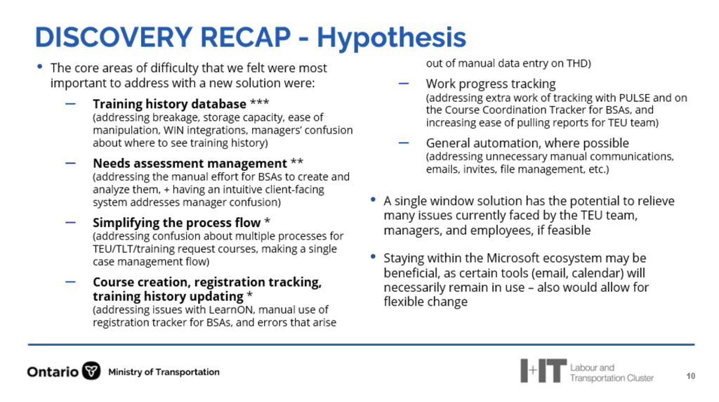
The team needed a "single place to work" that served as the automated steward of the process
Initially, I ran a lot of Miro workshops to prioritize features by feasibility/impact, and craft workflows that would define the focus of the prototypes. These workshops resulted in a clear understanding of the essential feature sets for our primary & secondary user groups:
Training coordinators
They need an intuitive, flexible, automated tool to manage their courses, including the ability to:
edit course information,
create sessions,
manage registration,
manage communications,
update training history,
& progress tracking
Managers
view employee registrations and course requests
& make any needed approvals/cancels
Employees
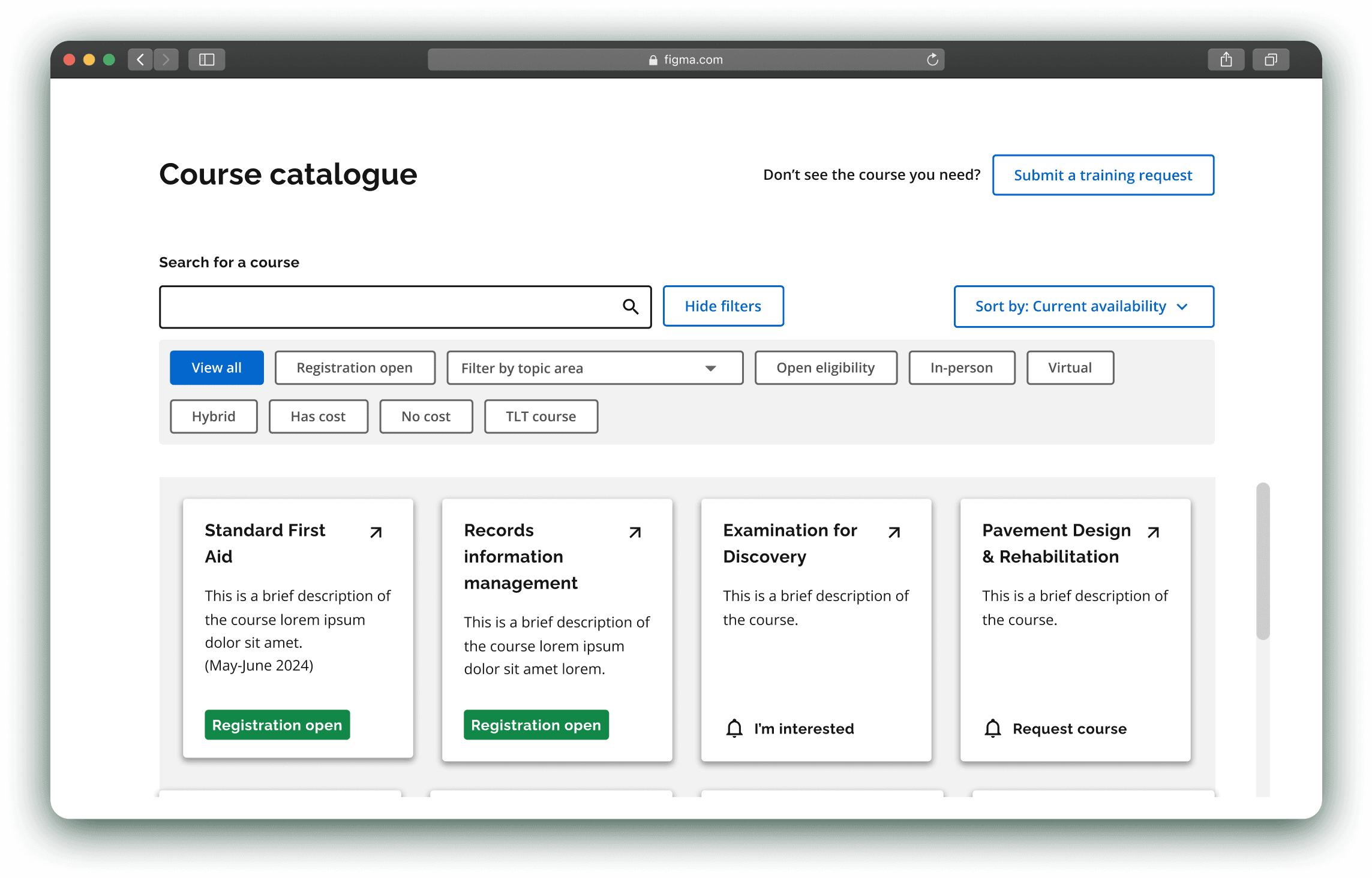
view the course catalogue,
register to courses + make needed attestations
& request any unavailable courses
View sample artifacts
Design iterations
From a glorified form ->
To a comprehensive course management tool
In my first attempt, I 'digitized' the training team's process from the perspective of the training coordinators. I represented each step of their workflow in a 1:1 linear manner, with the client team confirming every screen.
This inevitably led to many problems that were elucidated during concept / usability testing.
Sample V1 screens:
Training coordinator flow
Overly rigid:
The tool mirrored the process too linearly, not lining up with the way things actually worked
Without an overarching structure:
Screens felt isolated rather than part of a cohesive system, makes it hard to intuitively understand
Lack of data continuity:
The relationship between the data tables spread between pages was very confusing

Essentially, the V1 collected functional requirements, but did not unify those functions into a usable tool. To address these, significant structural changes were made V1 to V3:
Design iterations
An intuitive database
nformation and settings continuing to get denser and denser – basically also as my understanding improved over time, I could chunk the functionality more efficiently
Key learnings
I learned what it means to build an application
for an expert user base
In my first prototyping attempt, I attempted to help users go through the training coordination process by limiting the available functionality step by step.
This ended up being good to assess functional requirements, but terrible for an actual tool.
The limitations of V1 resulted in essentially hand-holding users rather than enabling users with functionality and trusting them to do their job.
This mindset shift from 'only surface what is relevant' —> 'give experts the flexibility to decide what is relevant' was directly responsible for the success of the project.
V1
Step 1
Settings
Function 1
Step 2
Settings
Function 2
Step 3
Settings
Function 3
Step 4
Settings
Function 4
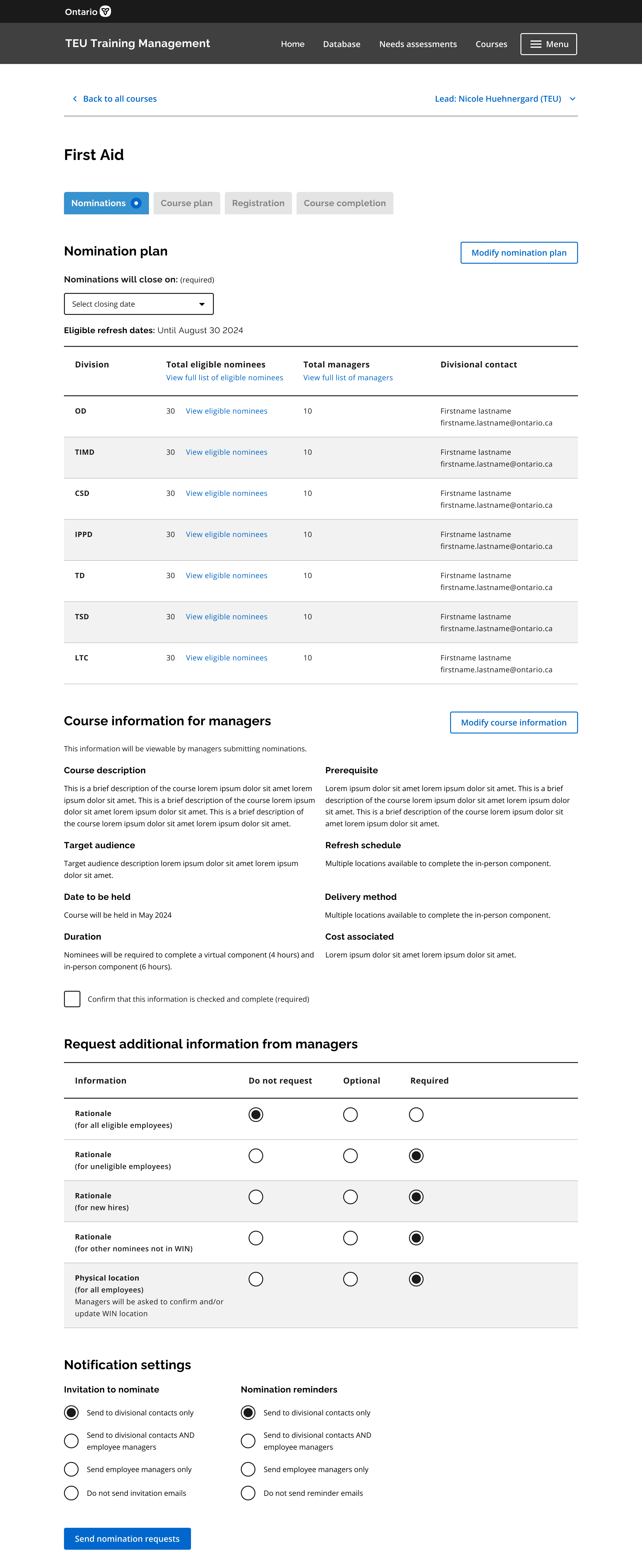
V3
Course management platform w/ centralized database
Settings
Function 1
Function 2
Function 3
etc.
Figure illustrates some key architectural differences between V1 and V3.
*This is something that is likely very obvious to a seasoned designer, but this was my first ever time building an 'application'.
thanks for visiting!
feel free to reach out :-)